
Why Most B2B Tech Marketing Looks Expensive… But Explains Nothing
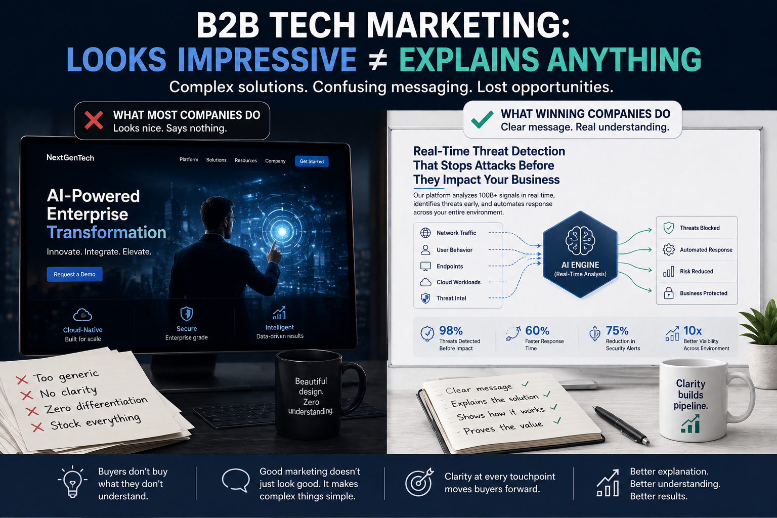
Enterprise Tech Companies Spend Millions Building Products
Then Explain Them With a Stock Photo and a Blue Gradient
B2B tech companies spend years building genuinely sophisticated products.
Entire teams of engineers, architects, analysts, product managers, and specialists work together to solve complex problems that most buyers barely understand.
Then marketing gets involved.
And suddenly the homepage features:
a smiling executive touching a floating hologram
three buzzwords about “innovation”
a stock photo of someone standing in a server room
and an animation that somehow explains absolutely nothing
The website looks beautiful.
The buyer still has no idea what the company actually does.
That’s the asymmetry nobody talks about in B2B tech marketing.
The Investment Gap Nobody Notices
Enterprise companies invest heavily in building technology.
But the investment in explaining that technology? Usually microscopic by comparison.
And the default marketing tools most companies rely on aren’t helping:
generic stock imagery
templated websites
abstract motion graphics
“AI-powered digital transformation” diagrams that could belong to literally any SaaS company on Earth
The problem isn’t aesthetics.
The problem is comprehension.
Complex B2B products don’t fail because buyers are unintelligent.
They fail because buyers never get far enough to understand the value in the first place.
If your messaging loses someone in the first 10 seconds, the sophistication of your solution becomes irrelevant.
The Real Problem: Most Visuals Don’t Explain Anything
Most enterprise marketing materials are designed to look modern.
Very few are designed to make complex ideas easy to understand.
That’s a completely different skill.
Good B2B tech marketing isn’t decoration.
It’s translation.
It’s taking something technically dense and turning it into something instantly understandable for a skeptical buyer who has 14 tabs open and two back-to-back Zoom calls.
That’s why the process matters.
At Frame Concepts, every project starts the same way:
A blank page.
A pencil.
And a long conversation about what the product actually does.
Before the visuals.
Before the animations.
Before the shiny gradients.
Because if the core idea isn’t clear, no amount of design polish can save it.
Where Better Explanation Actually Changes Results
This kind of work impacts far more than just the website.
It shows up across every major B2B marketing function:
Product Marketing
Explainer videos
Interactive product tours
ROI visualizers
Platform walkthroughs
Content & Thought Leadership
Visual white papers
Data storytelling
Research reports
Infographics people actually finish reading
Sales Enablement
Sales decks
Competitive battlecards
Proposal visuals
Demo environments
Event & Field Marketing
Keynote presentations
Trade show visuals
Interactive booth experiences
Every touchpoint either helps buyers understand… or quietly confuses them.
And unfortunately, stock imagery tends to fall into the second category.
The Companies Winning at B2B Marketing Explain Better
The best enterprise brands don’t just build impressive technology.
They explain it clearly.
That’s the difference.
Because buyers don’t purchase complexity.
They purchase clarity around complexity.
And in B2B tech, the companies that communicate value fastest usually win.
Even if their competitors have a nicer holographic dashboard graphic.
